

Intro
In 2020, I joined the Tetris team at CIBC. We worked on crafting all the pages on both CIBC Canada and US public sites. Pages were transformed following the design system and framework for the new CIBC brand within the digital realm. The team is under public, and is responsible for a design system that works across all teams, and is compatible with the content management system - Adobe Experience Manager (AEM).
Timeline: Oct 2020 - Sep 2022
Tools: Adobe Experience Manager, Figma, Invision, Adobe CC, Confluence
Role: Visual designer
Team: Content designer, project manager, web developer, line of business, QA
Responsive web design
I designed 300+ responsive pages using AEM. Every page is authored and tested to be working perfectly on various breakpoints. I ensured the tone of voice was cohesive throughout all pages and the accessibility standard WCAG(AA) was met.
A few examples of the pages I worked on are the top 6 landing pages with the most traffic on the entire site.
Personal banking | Bank accounts | Credit cards | Mortgages | Ways to bank | Online services


Design Systems
Based on the brand guide that was provided by the branding agency, the design system is further developed and iterated. The design pattern across all teams was taken into consideration for the improvement of the system.
Fundamentals
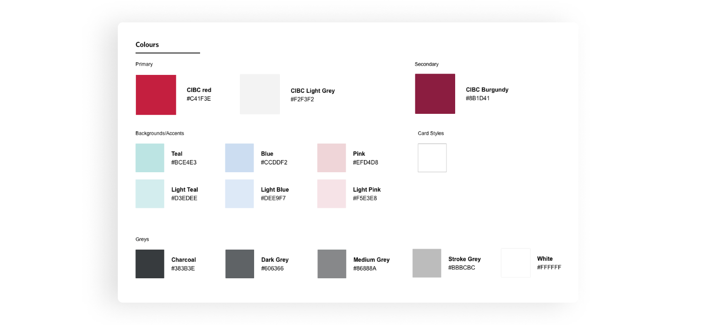
Colours - Grid - Typography


Typography Guidelines
Above the initial brand guide, many different ways of text styles have been further developed by different pods in the experience design team. I took charge overseeing the typography guidelines. With crawling through pages and numerous meeting with the design team, I was able to bring together the diverse applications of our type system. This effort resulted in establishing definitive guidelines and ensuring clarity and consistency among different pods.

Components
Banners
Initial styles and directives for banners were established, serving as a foundation.
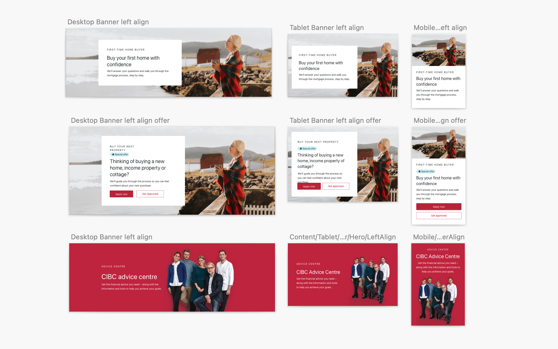
Banner Guidelines
Subsequently, additional banner iterations were devised by different teams to accommodate their design requirements. My role encompassed researching, synthesizing, and formulating comprehensive guidelines for the application of these diverse variations.

Icons & Illustrations
During the process of page creation, I create illustrations and icons to meet diverse requirements. These visual elements are constructed as components and seamlessly incorporated into the design library. This integration empowers the entire design team to employ these resources efficiently as needed.


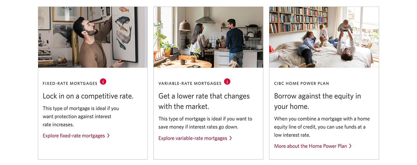
Callouts
Callouts are widely used when we design the page. Different styles of callouts are used for different purposes. Vertical callouts are used to compare distinct products and to present content side-by-side for better organization. Horizontal callouts are for crafting uninterrupted content or a sequence of promotions and features.

Other components
Numerous additional components, encompassing a wide array such as buttons, links, tabs, forms, and warning messages, have been created within our design system. These components have been integrated into the design library within both Figma and the CMS (AEM), ensuring their seamless incorporation into our design framework.


Accessibility
Adherence to the Web Content Accessibility Guidelines (WCAG) is imperative for all our pages. I have taken the necessary steps to ensure that my designs are accessible and inclusive for a wide range of users. This includes incorporating h-tags, alt text, hidden text, and meticulously verifying color contrast accessibility, among other measures.